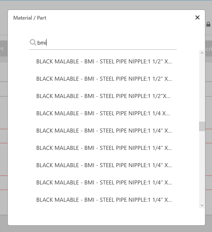
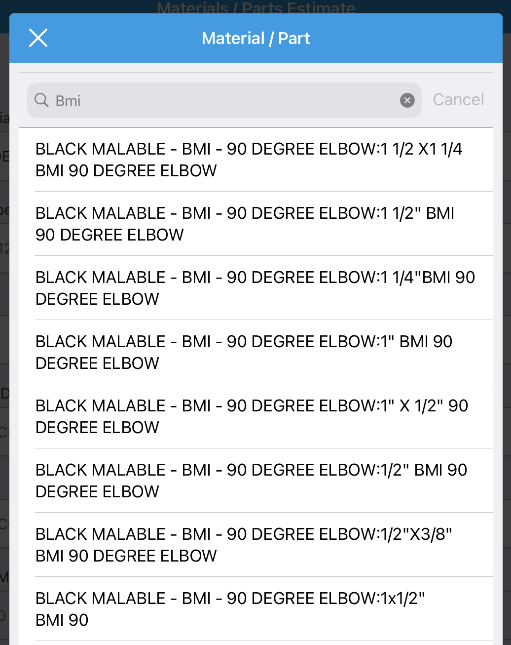
For the searchable dropdowns on the Windows app, it would be significantly more user friendly if the entries were formatted to appear exactly as they do on IOS. For longer entries on Windows they appear in the dropdown with a "..." when the entry becomes too long. This causes the user to not be able to see the end of the entry making it impossible to differentiate long entries with identical beginnings. Where as, on IOS the long entries simply continue on the line below when the entry is too long allowing the user to easily differentiate between long entries with similar beginnings.

1
Comments
Please sign in to leave a comment.
Hi Chad,
Thanks so much for submitting this! I can see how helpful it would be to look the way you are describing. I know our team has been working on search and filter capabilities recently. I'll be sure to update here if we have anything new!
Best,
Hazel Kral
Sr. Customer Engagement Manager