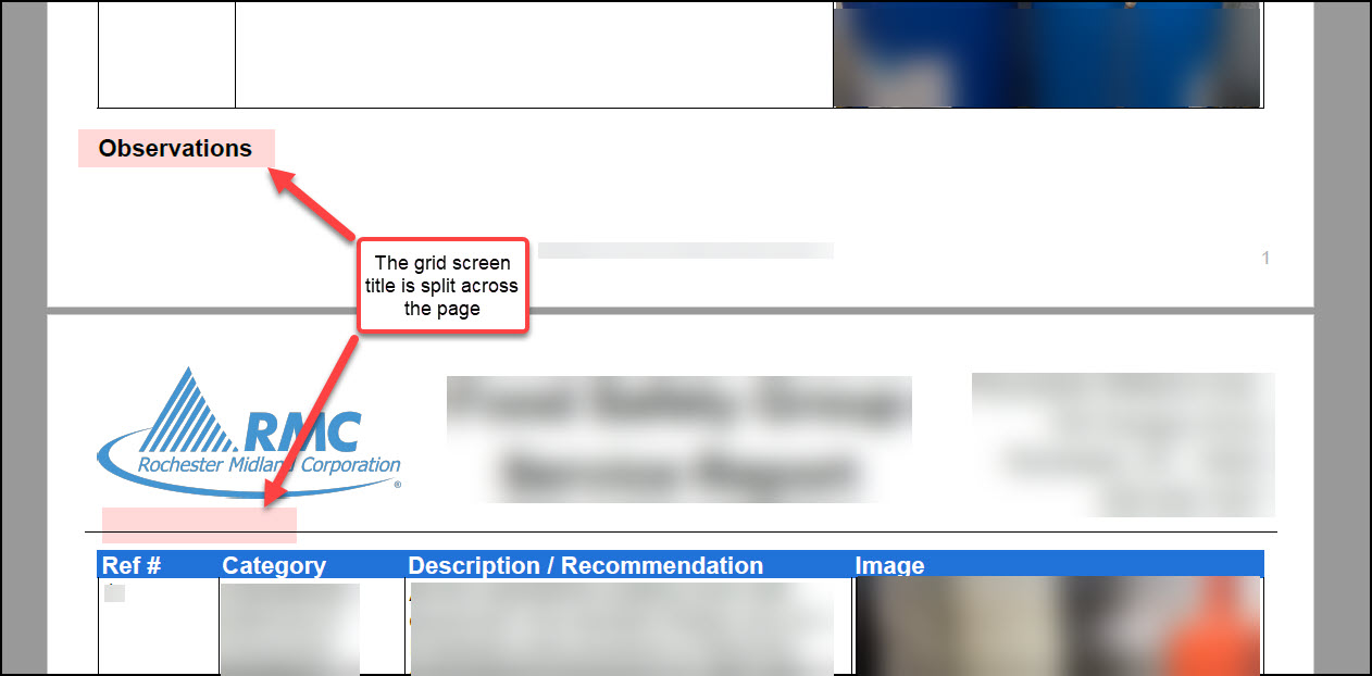
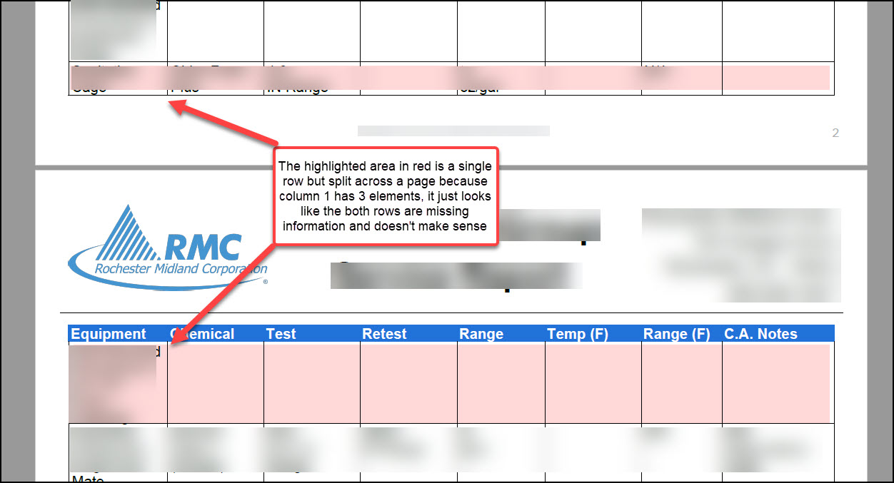
The grid screen formatting on the PDF does not look very professional and is difficult to read when it page breaks at odd places. Two example images are below. The grid screen title breaks across a page oftentimes and grid rows oftentimes page break separating the data making it appear that there are two separate rows of data. This makes the row data not make sense.
0
Comments
Please sign in to leave a comment.
Hi Jacob,
Thanks so much for bringing this to our teams' attention. I can understand how this would be frustrating in reviewing your submissions. I'll pass this over to our Development Team with your feedback as we are always looking to improve!
Depending on the layout of your form and the information you're collecting a lot of our clients find using the "Page Break" feature in our Designer PDF to be helpful if they are looking at a grid like this. So for this example, you could add a page break above "Observations" which would then start the next Grid at the top of the next page. Of course, if there is so much information in your grid that it spreads to multiple pages that would result in the same situation as well as if on the page previously if the information amount fluctuates it could leave a larger space before your next grid.
Again though, depending on your use case maybe this could be helpful. Here is an article with more information https://help.gocanvas.com/hc/en-us/articles/115006655667-How-to-add-new-Sections-Columns-and-Pages-to-the-PDF.
Thanks,
Hazel Kral
Sr. Customer Engagement Manager